Oakwood Cemetery
Stories by Numbers
by Lauren Caddick
Abstract/Intent:
Using data collected from the Oakwood Cemetery in downtown Raleigh, I would like to create an interactive map that can show the progression and changes of the cemetery through time. This map would show, through color and form, the evolution of the cemetery through time as well as notable categories of burials (Confederate soldiers, government officials, women, “green” burials, and monuments.) Users will have the option as data appears to select pre-identified graves with additional historic information and view “pop-up” content.

The scope described is large. Possible narratives to focus the content of this endeavor would be the Raleigh Confederacy, African-American burials, African-American soldiers, Women/Feminism, “NC Royalty”, and Cemetery Landscaping/Landscape Architecture.
Raleigh, one of the modern South’s most prominent cities, is searching for an identity. Embodying progressive values -- with a liberal voting population and numerous thriving cultural institutions, such as NC State University and the North Carolina Museum of Art -- the city simultaneously retains a controversial conservative history. Confederate landmarks dot the city’s main thoroughfares and the state’s economy still relies heavily on agricultural industries whose legacies are marred by slavery and economic inequality. Examining the cultural composition of this city’s most prominent cemetery will challenge users’ notions of who constitutes the city of Raleigh. Does the presence of the deceased in a living landscape like Oakwood Cemetery influence a city’s present-day identity?
Users bring a set of previously-formed expectations of Oakwood Cemetery to the table: it is large, overwhelming, and unnavigable. This map experience provides a novel way to comprehend this vast area of land (102 acres, including over 22,000 graves.) Time, especially as it relates to life and death, moves slowly in everyday life. The surprise of this piece comes with the ability of the user to control time and move quickly through the centuries. Many generations will come and go before the user’s eyes as they navigate the populations in Oakwood Cemetery
Execution:
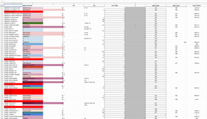
In Square 1 of this project, I explored TouchDesigner’s capabilities as an application for communicating these ideas. By assimilating my own dataset from the Oakwood Cemetery and interpreting it via TouchDesigner into channels of form, color, and shape within a space, the intent was to create a visualization of the data by year on a 3-dimensional geometric plane. Perceptual curiosity would be sustained by the control of the map being put into the hands of the user (allowing them to “play God” momentarily and control the “entrance” and “exit” of "cemetery residents.")
The interactive map would be rendered via the program and projected, then manipulated within TouchDesigner — ultimately, the control over what year is presented by this visualization could be integrated into a physical “knob” or “slider” so that the user would be able to control the progression of time.
To have greater control over my data and the narrative within this project, I focused the presentation on featuring the number of infant burials per year versus the number of adult burials, both to stimulate epistemic curiosity and provide greater historical context for the data in of the lives of Raleigh citizens. In thinking about where this project will go next, I do not want to take this approach and instead want to expand my scope. I believe that a focus on infant mortality will only find a small audience, whereas finding a way to more broadly incorporate the cemetery’s data will be more accessible.
Ultimately, utilizing TouchDesigner for this visualization did not provide me with the most successful outcome. While TouchDesigner was effective at reading the initial table of data and selecting the various channels of information, achieving a legible visualization in this application with the data I presented was a challenge, both from a programming standpoint and ultimately from a image capturing standpoint. I was not successful at achieving my intended out come and I will be shifting my focus and changing tools as I approach the future of this project.
Code:
The coding/programming involved in achieving this visualization was unexpected and required much collaboration with Emil Polyak. To achieve this visualization, we utilized this script to allow TouchDesigner to read the number of people in each section and visually represent stacked vertically as cubes along an axis:
table = op('non_infants')
tablerows = table.numRows
newTable = op('table3')
newTable.par.dims = 1
newTable.par.cols = 1
newTable.par.rows = tablerows
prevSectionNum = 0
prevCounter = 0
for i in range (0,tablerows):
sectionNum = table[i,0]
if sectionNum == prevSectionNum:
newTable[i,0] = prevCounter + 1
prevCounter = newTable[i,0]
else:
newTable[i,0] = 1
prevCounter = newTable[i,0]
prevSectionNum = sectionNum
Next Steps:
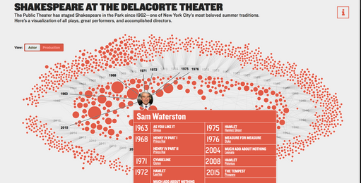
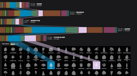
My goal for the next phase of this project is to continue to work with the data from Oakwood Cemetery, but to make an application that could interactively show the changes in the data through time. Some potential tools for achieving this are Adobe XD and Adobe Animate. I will start with building the narrative of the West Branch section of the cemetery, a section with many infamous stories and a large population. I am inspired by the interactive work of Cloudred, a design firm whose specialty is data visualization. Their award-winning projects, specifically Shakespeare at the Delacorte (https://www.cloudred.com/labprojects/shakespeare/) and New York City Trees (https://www.cloudred.com/labprojects/nyctrees/) visually organize large sets of data in a way that is simple, navigable, and engaging.


